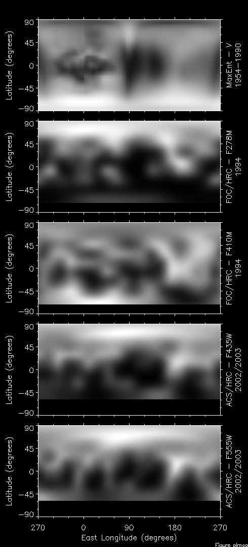
On the left you see all of the maps I've generated of Pluto over the years.
The next two panels show reprocessed data from HST that were taken between 1994 June 20 and 1994 Jul 01 when Pluto was at 29.8 AU and a latitude of 12.7 degrees. At this time our the northern pole really begins to come into view while the southern pole begins to slip into winter. Two maps are shown for this epoch, one in ultraviolet light (F278M) and one in blue light (F410N). These data were first published in 1997 and a revised analysis was published in 2010.
The bottom two panels show the most recent data from the Hubble Space Telescope (HST) where 394 images were combined to create an albedo map of Pluto in blue (F435W) and green (F555W) light. The data were taken between 2002 Jun 11 and 2003 Jun 08 when Pluto was 30.6 AU from the sun. During this time we were viewing Pluto from a latitude of roughly 30 degrees. That means within 30 degrees of the south pole we can't see the surface and that part of Pluto gets no sunlight (just like Antarctica in the winter). Between these two epochs the distance from the Sun changed by 2.5% but the area of the unilluminated polar region increased by a factor of four. These maps were published in 2010.
One reason for extracting maps of Pluto's surface so many times is just to try out new techniques and tools. The Hubble Space Telescope wasn't available prior to 1991 and it clearly was a tool worth using on this problem. Another reason for multiple maps is just to look to see if anything is changing on the surface. We know there is a lot of nitrogen ice along with methane ice that's mixed in. These ices must move around on the surface with the progression of the seasons. We've seen something like this on Mars with the carbon dioxide ice moving back and forth between its poles during the Martian year. Well, this process must also happen on Pluto. In the case of Pluto, its year is much longer (248 years) but the seasonal cycle is much more extreme thanks to Pluto's eccentric orbit and its large obliquity (that's the tilt of the pole relative to the orbit, for Earth it's 23 degrees, for Pluto it's nearly 80 degrees). The big question in my mind for the past three decades that I've been working on this is does the seasonal cycle change in the surface enough to see it from our remote vantage point on Earth? There have been many theories published that tell us change is likely but we've had very little data from which to say which theories (or even guesses sometimes) apply to Pluto.
The best pair of maps to use in looking for change are from the FOC F410N and ACS F435W data. These two maps are very similar in resolution and wavelength of light used. It's not hard to see that there are large scale changes that are evident here. The most striking change is at the top (north) of the maps. Between 1994 and 2002 the north pole of Pluto has brightened though other changes are evident as well. A brightening of the north pole is a little odd. I imagine that a lot of clean surface ice accumulated on the north pole during its winter season. Now it's coming into view and getting warmed up. I would expect the surface to start out bright and then gradually dim as ice sublimates away and moves to the other pole. But, that's not what is happening and it will be a very important clue to understanding seasons on Pluto and how the surface and its atmosphere interact.
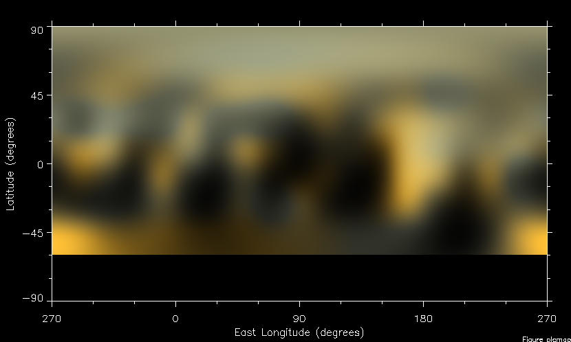
I've tried many times to estimate what Pluto would look like if you were there in person. These new maps give me the best data yet to do this. The two maps I have give me the reflectivity of every spot on the surface but at only two wavelengths. To get Pluto's true color I really need to know the reflectivity at all colors visible to the eye. Thus to get true color I have to make some assumptions. To do this I guess there are two sorts of things on the surface that give rise to its color: neutral colored ice (can be dark ice or bright ice) that has no color at all, and, red gunk. We know these two components are on the surface and we have good guesses for their individual spectra. I then use the maps to estimate how much of these two things are present at each point on the surface. From that estimation I can then compute the color. The map below shows this true color rendition.
There's one peculiar thing about this map and it has nothing to do with Pluto. There are regions that look (to me) like they have a slightly bluish cast. Well, those regions are actually gray, not blue at all. But, when you put that "color" next to the other yellow-orange color it looks blue by contrast. Strange.
The map above shows extremes in brightness (albedo). The darkest areas are as dark as coal, reflecting only a few percent of the light that hits it. The brighest areas are almost perfectly reflecting. There is just as much contrast on Pluto as we've seen on the surface of Saturn's moon Iapetus. That alone make Pluto stand out from most things in the solar system. Looking a little closer we see that the north polar regions are generally more neutral in color and brighter than average for Pluto. This is the area that is recently emerged from a 120-year long winter. This color and albedo is consistent with it being a region covered in frost deposits, presumed to be nitrogen and methane ices. Moving toward the equator the trend is toward more albedo variations and more color diversity and that trend continues right up the the southern-most region we can see. We won't know for sure why Pluto looks like this until the New Horizons spacecraft gets there in 2015 but it's going to be fun to try and work this out.
Marc W. Buie, Southwest Research Institute
