

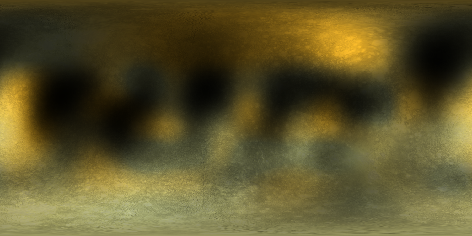
The image to the left is a thumbnail of the new color map. This map has a black stripe at the bottom because that area was hidden from view at the time the map was made. It is also in the orientation and format of the maps I use in my own software. In particular, Pluto's north pole is up in this image where I use a north pole definition based on the positive spin pole. Also, the map use east longitude increasing from left to right. I've been using this coordinate system to map Pluto for 30 years.
This image is the same as above except for a couple of cosmetic changes. First, I've filled in the missing region with something plausible for the surface albedo at the south pole. Second, the orientation of the image has been altered to match the convention used by the program xplanet. This program uses a coordinate system similar to that proposed by the IAU which defines "north" to be that pole north of the Earth's equator. In the case of Pluto my (spin-defined) north pole is the IAU's (and xplanet's) south pole. Also, xplanet uses west longitude which flips the image from left to right. Finally, xplanet puts the zero degree reference longitude in the center of the image. Clicking on on the image will retrive a 720x400 pixel image version of the map that that you can use in xplanet to create a spinning globe of Pluto.
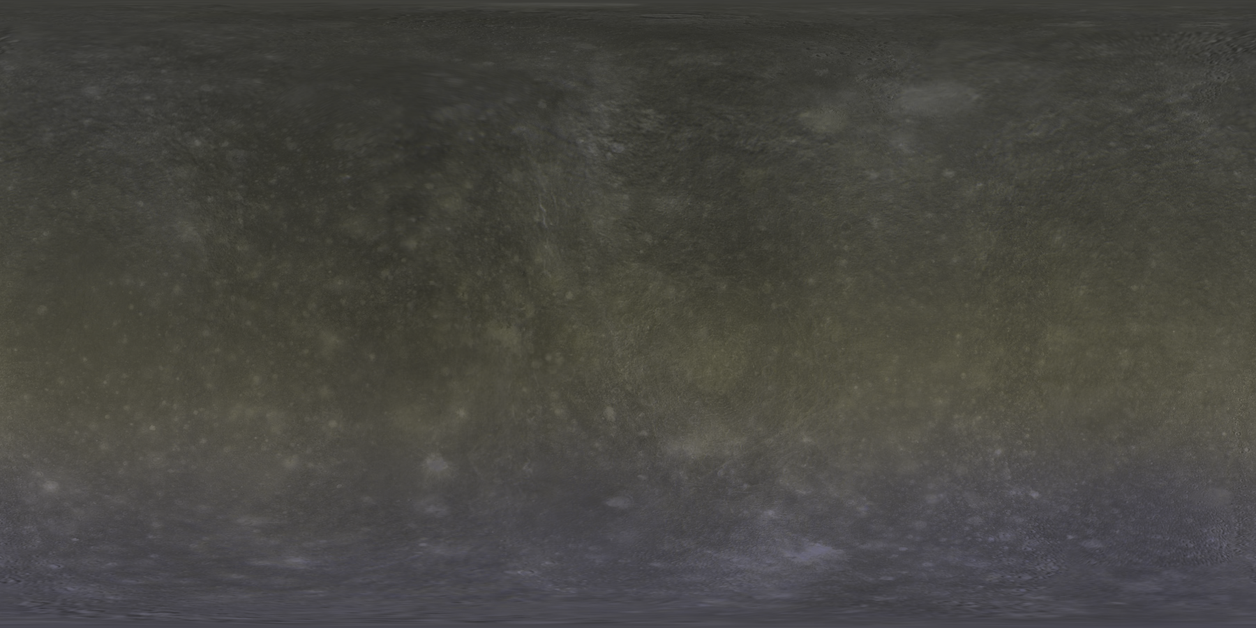
In this image I have taken my new albedo map and merged it with surface maps of Callisto and Rhea to simulate geologic features and texture on the surface. This image is 1800x900 pixels and is also in xplanet format. An interesting thing I see here is that by adding texture it seems to eliminate the optical illusion of the bluish regions. This map will let you create visually interesting renditions of Pluto but the accuracy of such renderings is low. I can do a much better job of this but it requires specialized software. Still, this is a fun toy and I've enjoyed fiddling around with it. Just don't forget that this map is my artistic interpretation of Pluto's surface. We have not really imaged any craters on the surface. That will have to wait for the New Horizons flyby in 2015.
Xplanet does such a nice job with Pluto that it seemed a shame to not have something pretty for it's largest moon, Charon as well. The image to the left is another artistic rendering of Charon also blending other planetary satellite surfaces for texture while including the sense of the data I have on Charon. There are some very subtle albedo features included in this art map that are close to reality. First, there is a slight (8%) variation in brightness as Charon rotates. That has been included in the map, though it's very hard to see. Also, my data indicate there may be a very slight bluing of Charon's poles and I've included this as well. You have to look very carefully to see this but it's there. I have also included in the map the approximate average albedo relative to Pluto as well as its color (grey). When seen together the contrast is really striking between Pluto and Charon.
These maps and images are freely available as long as you credit the source. Any web pages, publications, or any other published use of these maps should provide a legible credit line consistent with the medium that states: "Images are courtesy of Marc W. Buie, Southwest Research Institute".
Marc W. Buie, Southwest Research Institute
